In this section, Rahul Bhargava describes how CMS.631 Data Storytelling Studio grew out of workshops with organizations interested in using their data to leverage social change. He also shares three key features of the course design: engaging students in “making things,” assuming the role of facilitator in the classroom, and balancing authority and subjectivity when assessing learning in a process-oriented class.
An Origin in Workshops
Data Storytelling Studio has its roots in workshops I’ve facilitated for groups interested in using their data to argue for change. About 10 years ago, I met with a group of Boston-based non-profit organizations. They understood that their data were assets, but they didn’t know what to do with them. That was a key moment for me. I realized I could help people figure out how to use their data to facilitate the kinds of social change important to their organizations. Since that time, my work has been rooted in helping others realize that their collections of data aren’t things, but rather forms of speech for doing work in the world.

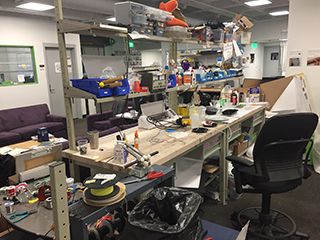
Materials for making “things to think with” in the common space outside of Rahul Bhargava’s office on the MIT campus.
A Series of Making Things
The studio-based course on campus is influenced by the work of the MIT Media Lab, where efforts are focused on making objects that help us think, or what we call “things to think with.” We’re informed by an approach to learning that says that these objects—these things we make—embody our learning. By externalizing them (making them outside our heads), other people can react to them and iterate on them. That’s why the Data Storytelling Studio is designed around a series of week-long “sketches,” or half-realized projects, that involve students in using different media (physical and digital) experimentally to create objects other people can use to engage with data in impactful ways.
Usually when you think of data visualization or data storytelling, you picture fancy black backgrounds with colored dots and lines and interactive features. The sketches are designed to disrupt that idea by introducing students to a wider range of the types of things we can do to tell stories with data. I want them to realize they have a tool belt of techniques at their disposal. Some of those tools are traditional maps and charts, of course, but there are also creative maps and charts that break some of the rules of conventional data visualization. Students learn that they can represent data with their bodies and can use evocative images and visuals to tell their stories in personal ways.
Following a Compass, Not a Map
Data Storytelling Studio is a compass-led course. I point students in the right direction, and then follow where they go. My role is to be with them on the journey to make sure they don’t fall into a giant crevasse.
— Rahul Bhargava
This is not a lecture-oriented course. As the director of the Media Lab, Professor Joichi Ito, says, we work by following a compass, not by following a map. A compass points you in the right direction, a map tells you exactly where to go. The Data Storytelling Studio is a compass-led course. I point students in the right direction, and then follow where they go. My role is to be with them on the journey to make sure they don’t fall into a giant crevasse (like using a data set that isn’t reliable or trying to structure an argument that won’t work with a particular audience)!
Being a facilitator in the classroom means giving up the role of being an expert in every domain covered in the course. There are students in the class every year that know far more about data analysis and are better at doing graphic design and building physical objects than me. I’m totally okay with that. I learn from them. I’m definitely the guide in the classroom and I’m in charge of the course, there’s no question about that. But I respect and honor the skills that students bring into the classroom. It’s an essential part of the course design.
Assessment without a Map
Assessment in a compass-led class can be challenging. MIT students tend to be most comfortable with quantitative assessments. In the Data Storytelling Studio, assessments take the form of critique sessions, which are inherently subjective. Many students struggle with that, so, to support them, I position myself as an expert in helping people tell stories with data. The body of examples I bring to the course demonstrates that I am an expert on the cutting edge of the field. During critique sessions, I express informed opinions about what works and what doesn’t about their data presentations, which students are welcome to disagree with, as long as they can provide strong justification. This balancing of authority and subjectivity seems to help them navigate assessment in this process-oriented course.
